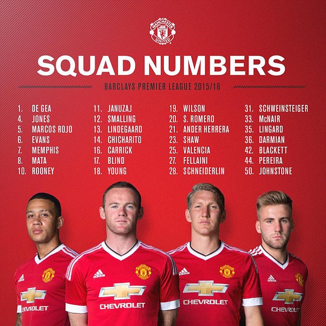
We like Adidas the brand. They generally seem to make pretty smart kit and often avoid the frills that aren’t required in the modern game.
But when we look at the current Manchester United kit we are baffled.
For our money it looks as if the manufacturers of the new Manchester United jersey couldn’t decide between three designs so they used all of them.
With the advent of the biggest kit deal in football history Adidas obviously wanted to do something distinctive.
And if you limit your view to the top of the kit everything is fine. No collar – great. And a streamlined and mininal design – fine.
But what is going on with those strange, chunky, flappy white sleeve endings? It’s like the whole team is wearing a crudely fashioned captain’s armband from the 1970s.
And the Adidas stripes stop at the end of the shoulder on the new jersey? What’s all that about?
It’s as if all three of the short-listed designs were superimposed on top of each other on the computer and then sent off to China by mistake for manufacture.
Regular readers know that we don’t mince our words where it comes to Manchester United. Some of you may love the kit. But we simply hope that Manchester United’s season isn’t as disjointed and mish-mash as the new jersey.
Manchester United faithful: Are you fans of the jersey?


Duncan
Aug 15, 2015 at 4:03 pm
So this is a rhetorical question or what?
J
Aug 15, 2015 at 4:18 pm
The Adidas stripes stop to leave a plain sleeve for the Barclays Premier League badge